


 Call Us




Scaled Agile organises measurement into three domains: outcomes, flow and competency. Within flow it names six metrics, and flow load is the one most leaders under-use despite it being the fastest explanation for why a train that looks busy is delivering slowly. Velocity is not on the list, which is the first thing worth knowing if you are used to reporting it.
Key Highlights
- SAFe measures across three domains: outcomes, which asks whether solutions meet customer and business needs; flow, which asks how efficiently value is delivered; and competency, which asks how proficient the organisation is in the practices that enable agility.
- The six flow metrics are flow distribution, flow velocity, flow time, flow load, flow efficiency and flow predictability.
- Flow load measures work in progress and is usually the fastest diagnosis for a train that appears busy and delivers slowly.
- Team velocity is not one of the flow metrics and does not travel upward, because it is relative and not comparable between teams.
- Reporting a single domain in isolation is the common failure: flow metrics without outcomes measure efficiency at producing things nobody needed.
- Business value assigned to PI Objectives during PI Planning is the input to predictability, which is why assigning it outside the event degrades the measure.
Why the measurement vocabulary changed
If you learned Agile measurement through team-level Scrum, most of what you know does not travel to this level.
Velocity is the clearest example. It is relative, deliberately imprecise, and calibrated per team. It is genuinely useful for a team forecasting its own next Sprint and it is meaningless the moment it leaves that team, because one team's eight is another team's thirteen. Reporting velocity upward, or worse comparing it between teams, is one of the more damaging things a delivery organisation can do.
What replaces it is a set of measures that are comparable because they are based on time and quantity rather than on estimation. That is the underlying logic of the flow metrics, and it is why they exist as a distinct set.
The three measurement domains
Scaled Agile frames measurement as three questions rather than as a list of numbers.
Outcomes. Do our solutions meet the needs of our customers and the business. This is the domain that justifies everything else, and it is the one most organisations measure worst because it is the hardest to instrument.
Flow. How efficient is the organisation at delivering value to the customer. This is where the six flow metrics sit, and it is the domain most likely to be reported well because it is the easiest to extract from tooling.
Competency. How proficient is the organisation in the practices that enable agility. Assessment-based rather than telemetry-based, and the domain most often skipped.
The reason for three rather than one is that each alone is misleading. Strong flow with weak outcomes means an organisation efficiently building things nobody wanted. Strong outcomes with weak flow means it is working, expensively and unpredictably. High competency with weak outcomes means the practices are being performed correctly and are not connected to anything that matters.
That interaction is the single most useful thing to understand about SAFe measurement, and it is what a Leading SAFe certification training course spends time on when it covers measure and grow.
The six flow metrics
Flow distribution. The mix of work types moving through the system: new features, defects, technical debt, risk. SAFe names four categories deliberately, because a system that only tracks features will systematically under-invest in the other three until something breaks. The mix of work types moving through the system covers new features, defects, technical debt, risk. It answers what the organisation is actually spending its capacity on, which is frequently not what leadership believes. A train discovering that half its capacity goes to defects has learned something no velocity chart would show.
Flow velocity. The number of items completed in a given period. Note this is a count of items rather than a sum of story points, which is what makes it comparable across teams in a way team velocity is not.
Flow time. How long an item takes from start to finish. The metric closest to what a customer experiences, since it measures elapsed time rather than effort. It is also the metric most likely to embarrass an organisation the first time it is measured properly, because the gap between how long work takes and how long people believe it takes is usually large.
Flow load. The number of items in progress. This is the one leaders under-use and it is usually the most diagnostic. A train with high flow load and long flow time has a work-in-progress problem, not a capacity problem, and the remedy is to start less rather than to hire more. That distinction saves a great deal of money.
Flow efficiency. The proportion of flow time spent actively working rather than waiting. Typically far lower than anyone expects, which is why it is uncomfortable and useful. Low flow efficiency points at handoffs and dependencies rather than at how hard people are working, and it is the strongest available argument against the instinct to solve a delivery problem by adding people to it.
Flow predictability. How reliably the organisation delivers what it planned. At train level this connects directly to PI Objectives and the business value assigned to them. It is the metric executives ask for first and the one most sensitive to how honestly planning was done, which means a train under pressure to show high predictability will get it by planning conservatively rather than by delivering better. That is worth watching for, because the number improves while the organisation slows down.
Which of these to actually report
You do not report six metrics to an executive. You report the two or three that answer the question being asked.
| The question being asked | The metric that answers it |
| Why is delivery slow when everyone is busy | Flow load, alongside flow time |
| Where is our capacity actually going | Flow distribution |
| Can we rely on the plan | Flow predictability |
| How long will something take | Flow time |
| Where is the time being lost | Flow efficiency |
The pattern worth noticing is that each of these is a diagnostic rather than a score. That is the difference between useful measurement and a dashboard: a number that does not change a decision is overhead.
Why outcomes are measured worst
Of the three domains, outcomes is the one organisations report least well, and the reasons are structural rather than lazy.
The feedback loop is long. Flow metrics update continuously. Whether a Feature actually produced the business result it promised may take two quarters to establish, by which point three more Program Increments have happened and attention has moved.
Attribution is genuinely hard. Revenue moved, and so did the market, the pricing, a competitor and the sales team. Isolating the contribution of a particular piece of delivered software is not straightforward, and organisations that try often produce numbers nobody believes.
Nobody owns it. Flow metrics have an obvious owner in the train. Outcome measurement sits between product, finance and the business, which in practice means it sits nowhere.
The workable approach is to stop trying to measure outcomes comprehensively and instead attach a hypothesis to the objectives that matter. State what you expect to change and by roughly how much, then check. Half the value is in the discipline of stating it before building, because a surprising number of objectives cannot survive the question of what would be different afterwards.
This connects directly to how business value is assigned during PI Planning. A Business Owner assigning a high number to an objective nobody can describe an outcome for is the first place the measurement problem shows up, and the cheapest place to fix it.
How predictability connects to PI Planning
Worth pulling out, because it links measurement back to an event.
Teams commit to PI Objectives, and Business Owners assign business value to them during PI Planning. Predictability is measured against what was committed.
SAFe distinguishes committed objectives from uncommitted ones. Uncommitted objectives sit in the plan and are excluded from the predictability measure, which exists so teams can stretch without being punished for missing a stretch. Remove that distinction and teams stop stretching, because there is no upside and a visible downside.
Two anti-patterns follow directly. Assigning business value outside the event removes the negotiation that makes the numbers meaningful. And treating uncommitted objectives as commitments destroys the mechanism that made honest planning safe.
What not to report upward
Four things that damage more than they inform.
Team velocity. Relative, uncalibrated between teams, and invariably read as productivity by anyone outside the team. The moment velocity is reported upward, it becomes a target and stops being a forecasting tool.
Percentage complete against fixed scope. It assumes the scope was right, which is the assumption the framework exists to relax.
Individual utilisation. Guarantees high flow load, since fully loaded people start more work rather than finishing it. This is the metric most directly opposed to flow.
Story points in aggregate. Adding estimates across teams produces a number with no meaning and considerable authority, which is a bad combination.
The common thread is that all four measure activity rather than value delivered, and all four get optimised the moment they are watched.
Building a report that leaders act on
A short structure that works, based on the three domains rather than on available data.
Lead with an outcome. What changed for a customer or for the business. If nothing did, that is the most important thing on the page, and burying it under flow metrics that look healthy is how organisations spend three Program Increments getting efficiently nowhere.
Follow with the flow metric that explains it. One or two, chosen to answer why. Flow load and flow time together explain most delivery problems.
Add the competency picture only when it is the answer. If flow is poor because a practice is not established, say so. Otherwise leave it out.
Show the trend, not the snapshot. A single value invites a target. A trend invites a question, which is what you want. Three Program Increments is usually the minimum for a trend to mean anything, which is worth stating explicitly to an audience seeing the numbers for the first time, since the instinct is to react to the first data point.
The test for any metric on the page is whether a leader could take a decision from it. Flow load rising over three PIs while flow time lengthens supports a decision to stop starting work. A velocity chart supports no decision at all at that level.
Understanding which numbers belong in that conversation is a meaningful part of what separates a certified SAFe Agilist from someone who has read the framework, and the free Leading SAFe practice test will show you how much of the measurement vocabulary you already hold.
The competency domain, and why it gets skipped
The third domain is assessment-based rather than telemetry-based, which is why it is quietly dropped from most reporting.
Competency asks how proficient the organisation is in the practices that enable agility. Unlike flow, it cannot be extracted from a tool. It requires people to assess honestly how well they are actually doing something, which is both slower and more uncomfortable.
It matters because it explains the other two. A train with poor flow and low competency in a specific practice has a diagnosis. A train with poor flow and no competency assessment has a mystery, and mysteries get solved by adding people.
The failure mode is predictable. Competency assessments get run once during adoption, produce a baseline, and are never repeated, which converts a diagnostic instrument into a historical document. Running one every second or third Program Increment is enough to see movement without consuming meaningful capacity.
The other failure mode is scoring assessments for an audience. Where results are reported upward as a performance measure, they immediately stop being honest, and an inflated competency assessment is worse than none because it removes the explanation for poor flow.
That is the same dynamic covered in the transparency material in Leading SAFe certification training, and it applies to every number in this article. A metric watched as a target stops functioning as a measure, which is why the reporting design matters as much as the metric selection.
Metrics and the PI Objectives that feed them
Several of the flow metrics depend on inputs generated during planning, which means poor planning produces poor measurement regardless of how good your tooling is.
Predictability is measured against committed PI Objectives. If objectives are written vaguely, predictability becomes unmeasurable, because nobody can agree afterwards whether the thing was delivered. Our guide to writing PI objectives covers what separates a usable objective from a restated backlog item, and it matters here more than it looks.
Flow distribution depends on work being categorised honestly at the point it enters the system. Where everything is logged as a feature because features are what get funded, the distribution metric will show a healthy mix and the train will quietly be spending half its capacity on defects.
Flow load depends on work being visible. Anything being done off-board does not appear, which is why flow load in organisations with significant unlogged work reads artificially healthy while flow time stays stubbornly long.
The general principle is that measurement quality is capped by input quality, and input quality is set at planning and intake rather than in the reporting layer. Organisations frustrated by useless metrics almost always have an intake problem rather than a tooling problem.
Getting the reporting cadence right
One practical point that decides whether any of this gets used.
Flow metrics update continuously and should be looked at continuously by the train, in the events that already exist. That is operational use and it needs no reporting layer at all.
Upward reporting is different and should run on the Program Increment boundary rather than weekly. Reporting flow metrics weekly to executives invites reaction to noise, and the natural response to a bad week is intervention, which increases flow load and makes the next week worse.
At the boundary, alongside Inspect and Adapt, the numbers have enough history to show a trend and are attached to a decision point that already exists. That is where they change behaviour rather than just producing anxiety.
If you want to check how well you already hold the measurement vocabulary before building any of this, the free Leading SAFe practice test covers it alongside the rest of the framework.
A note on tooling before that. None of these metrics requires a measurement platform. Flow load and flow time are derivable from any system that records when work started and finished, which every delivery organisation already has.
Where to start
If you currently report velocity and percentage complete, the highest-value single change is to replace them with flow load and flow time.
Those two together answer the question executives actually ask, which is why things take as long as they do. They are extractable from most tooling without a measurement programme, and they support a decision that velocity cannot support: start less work.
Add flow distribution next, because it usually produces the most surprising finding in the first month. Most organisations discover their capacity is going somewhere other than where they thought, and the gap between the assumed split and the measured one is often the single most useful number a train produces in its first year. It also tends to end the argument about whether technical debt is being addressed, in whichever direction the evidence points.
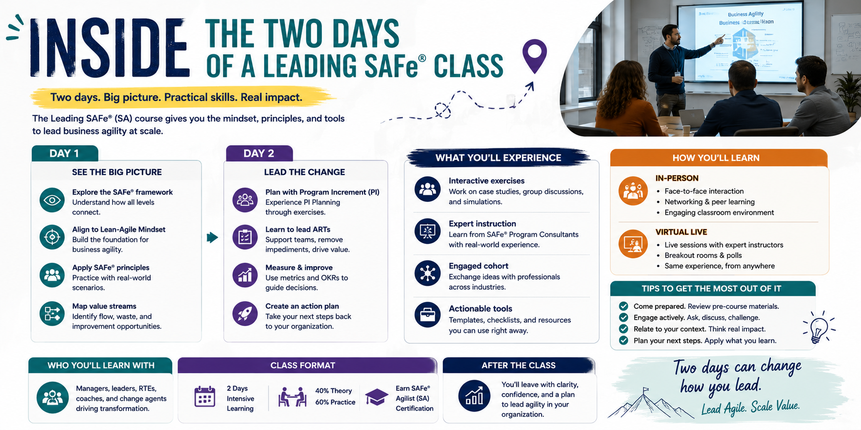
For the wider framing of how measurement connects to the rest of the model, Leading SAFe certification training covers it across two days with the exam attempt included, and current certification costs are listed separately.








 Lowest-Price Challenge











 Personalized Path


.webp)


 USA
USA  Canada
  India
India  UK
UK  Australia
  Singapore


