


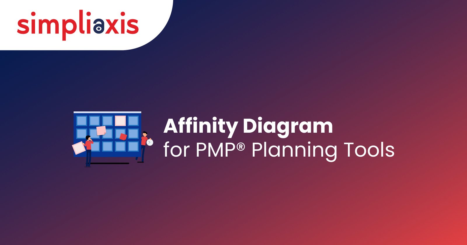
Affinity diagrams for PMP serve as invaluable tools for effectively grouping and organizing data, especially when dealing with substantial volumes of information. These diagrams prove instrumental in facilitating result-driven brainstorming sessions, which go beyond their utility in sorting data. They also aid in the formulation of action plans based on grouped insights. The versatility of affinity charts extends to various applications. This often involves problem-solving, process improvement, and audience engagement. For instance, some may opt for Trello templates to seamlessly integrate affinity diagrams into their workflow. Still not getting it? Let us go a little deeper to understand these important structures below.
Defining Affinity Diagrams in PMP
The affinity diagram in PMP is also known as the K-J method because of its creator, Jiro Kawakita. It refers to an analytical tool that helps organise ideas into subgroups with common themes or relationships. This diagram is used when there is a collection of data that must be collected to apply the related insights to plan projects. An affinity diagram for PMP is created through the organisation of data into specific categories, including systematic labelling.
The affinity diagram is a convergent thinking tool that helps organize or "cluster" different ideas and data. It is counted among the seven management and planning tools. Professionals have grouped data into categories based on natural relationships for several years.
The tool is used within project management and enables many ideas from divergent thinking tools to be sorted into different groups. It is usually based on their natural relationships for analysis and review. Professionals also use the affinity diagram for contextual inquiry to organize notes and insights from different field interviews. It can also be used to collect other freeform comments. Examples include support call logs, open-ended survey responses, or other qualitative data.
Steps for Creating Affinity Diagrams
Here is our detailed guide to creating practical affinity diagrams. Let us work through the steps of creating these structures:
Step 1: Transfer Your Ideas Onto Sticky Notes
Write down every piece of your information to organize it into a unique and separate sticky note. Stick your notes onto a wall or table when you are sure that you have written everything down.
Step 2: Sort Your Ideas Into Different Themes
Your next step is to sort all your ideas into different groups. You must start small – look for two unique ideas that are similar. Try to group them together on the wall or table. Later, you can look for two other ideas that relate to one another.
Stack ideas up on one another where they are essentially the same. Then, you can cluster these small groups into larger ones. It helps you gather similar ideas by theme.
Keep in mind that you might also have ideas that do not fit into any group at all.
Step 3: Title Groups
Now, you can "title" each grouping with a separate theme label. You can even call these the "header cards" or "affinity cards."
Create a three- to five-word description for the specific relationship. Later, you can write this description on a sticky note. Place the same at the top of the group that it describes. You can further use "subheader" cards to group sub-themes within a major theme when needed.
You can give “loner cards” their specific themes if needed.
Step 4: Develop New Solutions
You will find it much easier to see how ideas fit together by creating an affinity diagram for PMP. You can quickly spot projects and subprojects that you may need to run just by looking at them.
You will need to sense-check ideas at this stage. Furthermore, evaluate possible projects to see whether they are worth running. You can even prioritise them and manage them appropriately.
Why to Use Affinity Diagrams in PMP
Affinity diagrams can be useful for you in several ways. Having too many data points from different data sources can be hard to deal with because you may not be able to identify where each part goes immediately. Now, let us look further into why we should use affinity diagrams for PMP:
Simplify
Affinity diagrams simplify different ideas and arrange them so you can understand what idea is relevant and in what context. However, there is a chance of data being wasted if you have access to sufficient raw data but no useful way to use it to gather insights.
Organise
Ideas can be categorised into several functional areas. Otherwise, they can also be grouped where similar issues can eventually happen. Such matters can be addressed in close coordination instead of coming back to a similar issue later. It also helps solve the problem of not realising how any earlier decision would have affected the decisions.
Analyse
It is easier for you to see the context in it or what exactly can be inferred from a particular set of data when it is organised or categorised. It also allows you to see patterns and compare emerging data from them.
Identify Interrelationship
You can also draw relationships when you group ideas into different categories. For example, a few hiring requirements will have specific implications for the finance department. This is an example of the interlinking of categories.
Prioritise
An analysis of the data or ideas can bring up different suggestions. They can be further classified by checking the specific magnitude of change implementation that happens along with the same. You can decide what tasks or implementations should be prioritised based on such considerations.
Purpose of Using the Affinity Diagrams in PMP
Professionals with Project Management Professional PMP® Certifications from platforms like Simpliaxis know affinity diagrams. On the other hand, others working on expanding their respective project management tools or preparing for the official PMP exam must know the definition and uses of different affinity diagrams. In this particular context, affinity diagrams are used to:
- Group different data sources gathered during research
- Identify ideas generated during different brainstorming sessions
- Organize an unorganised or unsorted list of data to add structure
- Stimulate fresh patterns of thinking from groups formed during the affinity method process
How to Use the Affinity Diagrams in the PMP Planning Tool?
Organizing data or ideas through an affinity diagram is a powerful method to make sense of information. It enables a structured approach to decision-making. The diagram allows for the creation of categories and subcategories, with the flexibility to establish relationships between them as needed.
The focus shifts to leveraging the organized data for decision-making upon completing the affinity diagram. The same diagram serves as a visual aid and offers insights into potential actions. It is usually based on the revealed patterns and connections between categories. It also helps identify which ideas complement each other and enables a strategic analysis of their impact and interdependency on various categories.
Here are the steps to create an effective affinity diagram in terms of brainstorming sessions across organizations:
Step 1: Set up
Communicate the expectations to participants and designate a leader to guide the process. It is beneficial to have participants from different teams or departments for diverse perspectives.
Step 2: Generating Ideas
Encourage participants to generate ideas without immediate discussion or evaluation. Focus on capturing and documenting all ideas to ensure an efficient pool of information.
Step 3: Categorization
Categorize the ideas physically or virtually using sticky notes or project management tools. Place the first idea on the board and continue categorizing subsequent ideas to group them based on similarities. This step results in 5 to 8 categories, with the possibility of a few subcategories.
Step 4: Analysis
Analyse the relationships and patterns that emerge once the affinity diagram is complete. Evaluate the ideas based on their merit, implications, and relevance to the established categories. This analysis allows for informed actions based on the insights gained from the organized data.
Example of Affinity Diagrams
Creating an affinity diagram can be approached in various ways. PowerPoint proves to be a versatile tool for this purpose. Below are two methods with examples to guide you on how to create an affinity diagram using PowerPoint effectively.
Example 1:How to Create an Affinity Diagram in PowerPoint using Shapes?
1. Add a shape for recording ideas:
- Go to the "Insert" tab in PowerPoint and access the "Shapes" option.
- Choose a shape, like a rectangle, to create a space for recording ideas.
- Utilize smaller shapes with text to represent individual ideas.
2. Create groups to sort ideas:
- Generate as many groups as needed for sorting ideas.
- Showcase relationships between groups using overlapping circles.
- Overlapping circles can indicate connections between ideas belonging to different groups.
3. Sort ideas in groups:
- Place ideas into logical groups, showcasing relationships between ideas from different groups.
- Ensure visibility of overlapping ideas by adjusting group transparency through the "Format Shape" option.
Example 2: Affinity Diagram Slide Template for PowerPoint Presentations
1. Write ideas on cards:
- Use an Affinity Diagram PowerPoint Template featuring colorful cards to jot down ideas.
- Color-code the cards to categorize ideas systematically.
- Customize card colors using PowerPoint's "Shape Format" options.
2. Identify relationships:
- Begin identifying relationships among gathered ideas to form logical groups.
- Utilise the template to represent connections between different ideas visually.
3. Sort cards into groups:
- The Affinity Diagram PowerPoint Template offers pre-designed groups with color-coded cards.
- Sort ideas into these groups during a presentation or brainstorming session.
Conclusion
Affinity diagrams for PMP are the need of the hour, especially for project management professionals juggling tasks across organizations. Now, the question is, how do you learn to use these diagrams efficiently? It is where the Project Management Professional® (PMP) Certification comes in handy. Switch to Simpliaxis and seek help from the most proficient experts in knowing the do’s and don'ts associated with creating this diagram, tips, strategies, and more.