


Embarking on the journey to acquire Project Management Professional (PMP) certification entails navigating through a sea of concepts, tools, and methodologies. One such valuable tool in the arsenal of project managers is the Tornado Diagram. A Tornado diagram serves as a bar chart specifically designed to aid project managers in conducting sensitivity analysis. It enables them to assess the influence of different risks on a project's outcomes. In this comprehensive guide, we will delve into the intricacies of Tornado Diagrams for PMP, understanding their significance, application, and how they can aid in acing the PMP exam.

What is a Tornado Diagram?
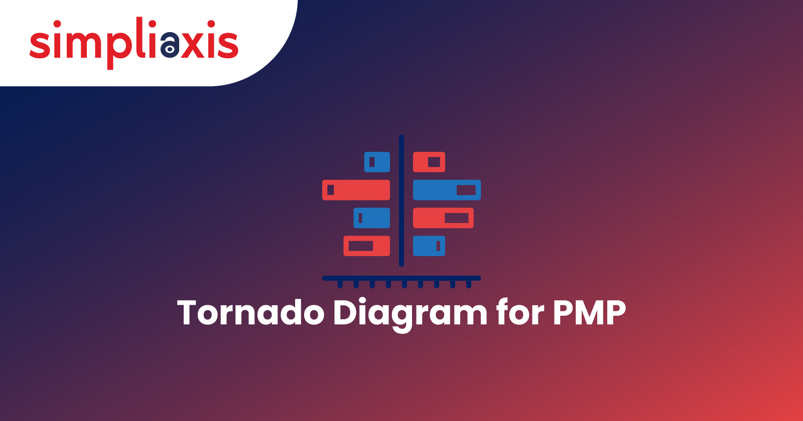
Before diving into its application in the realm of project management, let's grasp the essence of a Tornado Diagram. Essentially, it's a visual tool used for sensitivity analysis, depicting the impact of varying parameters on a particular outcome. Originating from the concept of tornadoes, it visually represents the "storm" created by altering different variables and observing their effects on the target metric.
Tornado Diagrams typically consist of bars representing different variables, arranged along the vertical axis. The horizontal axis displays the magnitude of impact, with longer bars signifying greater influence. These diagrams provide a clear visualization of the most influential factors affecting a given outcome, aiding decision-making processes.
What is a Tornado Diagram for the PMP Exam?
In the context of PMP exam preparation, Tornado Diagrams serve as a strategic tool for risk management and decision-making. Here's a step-by-step breakdown of how they're utilized:
1. Identifying Key Variables: Begin by pinpointing the critical variables affecting project objectives. These could range from resource allocation to stakeholder engagement, project scope, budget constraints, and beyond. Thorough stakeholder analysis and risk assessment are crucial in identifying these variables.
2. Determining Impact Ranges: Assess the potential impact of each variable by analyzing its plausible range of values. This step involves gathering relevant data, conducting risk assessments, and consulting with subject matter experts to ascertain realistic estimates. Utilize historical project data and industry benchmarks to inform impact range determinations.
3. Constructing the Diagram: With the variables and their impact ranges delineated, construct the Tornado Diagram. Organize the variables along the vertical axis based on their significance, with the most impactful variables positioned at the top. Plot the corresponding impact ranges along the horizontal axis, with longer bars representing greater potential impact.
4. Interpreting Results: Once the diagram is assembled, interpret the results judiciously. Focus on variables exerting the most substantial influence, as these warrant heightened attention during project planning and execution. Identify potential risk hotspots and prioritize mitigation efforts accordingly.
5. Iterative Analysis: As projects evolve and circumstances change, revisit the Tornado Diagram periodically to reassess the significance of variables and adapt strategies accordingly. Incorporate feedback from stakeholders and lessons learned from project experiences to refine the analysis and improve decision-making processes over time.
Benefits of Tornado Diagram
The utilization of Tornado Diagrams in PMP brings forth a myriad of benefits:
1. Visual Clarity: Simplifies complex data for better understanding, aiding quick decision-making and reducing ambiguity.
2. Risk Prioritization: Helps prioritize high-impact risks efficiently, ensuring resources are directed towards the most critical areas.
3. Strategic Planning: Enables preemptive addressing of potential challenges, leading to smoother project execution and fewer surprises.
4. Stakeholder Communication: Streamlines communication of risks and strategies, fostering trust and collaboration among stakeholders in project management.
5. Data-driven Decision Making: Supports informed decision-making based on data, leading to more accurate forecasts and better outcomes.
6. Efficient Resource Allocation: Optimizes resource deployment for risk mitigation, maximizing project efficiency and minimizing waste.
7. Scenario Analysis: Facilitates exploration of different risk scenarios, enhancing preparedness for unforeseen events.
8. Performance Benchmarking: Enables tracking and comparison of risk management effectiveness, driving continuous improvement efforts.
9. Cross-functional Collaboration: Fosters teamwork and alignment among stakeholders, ensuring a unified approach towards project goals.
10. Enhanced Problem Solving: Supports systematic problem-solving approaches, leading to more effective and sustainable solutions.
11. Risk Mitigation Strategy Development: Guides proactive risk response planning, reducing the likelihood of project setbacks.
12. Documentation and Audit Trail: Provides documentation for compliance and lessons learned, facilitating knowledge transfer and future planning.
How to read a Tornado Diagram?
Reading a Tornado Diagram is a process that involves comprehending its essential components and effectively interpreting the information it conveys:
1. Axis Interpretation: Begin by understanding the orientation of the axes. Typically, the vertical axis lists the variables being analyzed, while the horizontal axis represents the impact of these variables on the project outcome. This orientation aids in visually associating the variables with their corresponding impacts.
2. Bar Length Analysis: Assess the length of the bars in the diagram. Longer bars signify greater impact, indicating areas that require closer attention and possibly immediate mitigation strategies. By focusing on these high-impact variables, project managers can prioritize their risk management efforts effectively.
3. Pattern Recognition: Look for patterns within the diagram, such as clusters of bars or outliers. These patterns may indicate interconnected variables or exceptional risks that merit special consideration. Identifying such patterns allows project managers to delve deeper into the underlying dynamics of the project and anticipate potential challenges or opportunities.
4. Contextual Understanding: Interpret the diagram within the broader context of the project. Consider the project objectives, constraints, and stakeholder interests when analyzing the diagram. Consider the interdependencies between variables and potential ripple effects across different aspects of the project. This contextual understanding ensures that the insights derived from the Tornado Diagram are aligned with the overall project goals and strategic direction.
In essence, reading a Tornado Diagram requires more than just observing the bars; it necessitates a holistic understanding of the project dynamics and a keen eye for identifying critical variables and their implications.
Tornado Diagram in PMP Exam Questions
In the realm of PMP exam questions, Tornado Diagrams often feature in scenarios requiring critical thinking and application of project management principles. Common question types include:
1. Interpretation Queries: Candidates may be presented with a Tornado Diagram and asked to analyze the depicted information, identifying key variables and their implications on project outcomes. They may also be required to infer potential risk scenarios based on the diagram's depiction.
2. Scenario-based Questions: Scenarios involving risk management plan or strategic planning may incorporate Tornado Diagrams, prompting candidates to assess risk exposure and formulate appropriate responses. Candidates must demonstrate their ability to apply project management knowledge to real-world scenarios depicted in the diagram.
3. Application Exercises: Some questions may task candidates with constructing Tornado Diagrams based on provided data sets, demonstrating proficiency in utilizing the tool for decision-making purposes. Candidates must accurately interpret the data provided and construct a diagram that reflects the identified variables and their impact ranges effectively.
Lastly!
In conclusion, Tornado Diagrams emerge as invaluable assets in the repertoire of project managers pursuing PMP® Certification. Their ability to distill complex data into actionable insights equips professionals with the foresight and agility needed to navigate the dynamic landscape of project management effectively. By mastering the art of Tornado Diagram analysis, aspiring PMPs can elevate their strategic acumen and propel their careers towards success amidst the tempest of project complexities.
And as you embark on this journey, remember that preparation is key. Consider the PMP® Certification Training Course offered by Simpliaxis, designed to equip individuals with the necessary skills and knowledge required to excel in project management. With Simpliaxis' expert guidance and comprehensive curriculum, you can confidently tackle the challenges of the PMP audit and propel your career to new heights of success in the dynamic realm of project management. Elevate your project management journey with Simpliaxis' PMP® Certification Training Course - Enroll Now!
Also, Check: FAQ’s on PMP® Certification
FAQs
Q. What is a tornado chart used for?
A tornado diagram is a frequently utilized tool for illustrating the sensitivity of a particular outcome to fluctuations in specific variables. It visually represents how altering each input variable individually impacts the output, while holding all other input variables constant at their initial (nominal) values.
Q. How do you make a risk tornado diagram?
Utilizing MS Excel, create a bar chart representing both the upside and downside scenarios, followed by ranking the variables to form a tornado-like diagram. This diagram visually illustrates the sensitivity of the Net Present Value (NPV) to each variable. Notably, the exchange rate emerges as the most influential variable. Subsequently, based on this insight, you can proceed to develop a risk response plan aimed at effectively managing fluctuations in the exchange rate.
Q. What is a tornado diagram sensitivity analysis?
A tornado chart serves as a form of sensitivity analysis, visually depicting how sensitive the Result is to predefined Independent Variables. To generate a tornado chart, simply click on the "Tornado Chart. button within the Sensitivity Analysis dialog.
Q. What is a tornado graph for decision tree?
The purpose of creating a tornado chart, also known as sensitivity analysis, is to pinpoint the input variables or assumptions that exert the greatest impact on the value metric or decision problem. These critical factors are subsequently included in probabilistic and decision tree analyses for further examination and consideration.